

The Noob Factory Rolex Day-Date 228235JG 40mm is not a watch that depends on one dramatic feature. Its character comes from the way several very different surfaces meet in the same design: a pale green aventurine-style dial with visible texture, baguette-set hour markers, a warm rose-gold-tone case, a sharply fluted bezel, and the rounded geometry of the President bracelet.
That combination makes this version more difficult to reproduce than a conventional champagne, black, or sunburst Day-Date. A plain dial mainly asks the factory to control color, printing, and marker placement. Here, the dial itself already contains visual irregularity, while the baguette markers introduce strict geometry and the surrounding metal creates strong reflection. Each element is attractive on its own, but the watch only works when none of them overwhelms the others.
What matters most on this Noob Factory version is not whether one isolated detail looks impressive in a photograph, but whether the dial texture, calendar layout, bezel definition, case color, and President bracelet all feel like parts of the same watch.
The Dial Has Texture Before It Has Color
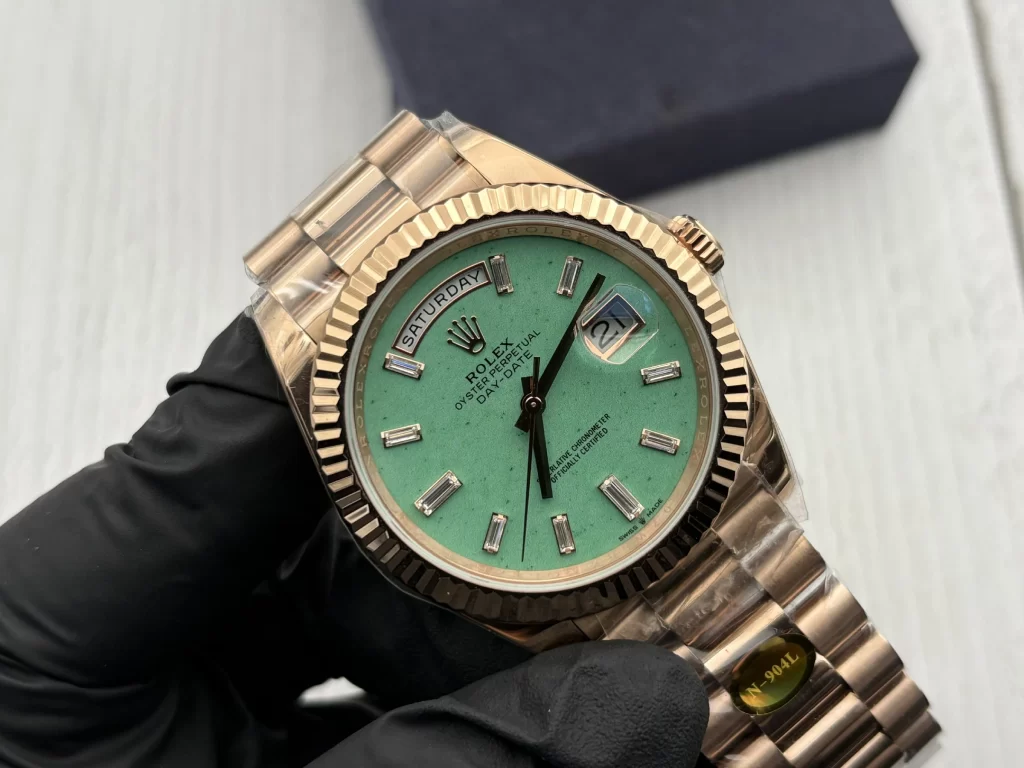
The first thing that separates this model from an ordinary green Day-Date is the dial surface. In the supplied photograph, the light green background is visibly irregular rather than perfectly flat. Small darker inclusions and subtle tonal variation interrupt the surface, giving it a mineral-like character that changes slightly depending on the angle and intensity of the light.
That matters because aventurine-style dials cannot be judged by color alone. A standard lacquer dial may succeed if the green tone is close and the finish is even, but a textured dial needs controlled inconsistency. If the surface is too clean, it loses the impression of natural material and begins to look like a simple painted dial. If the particles are too large, too dark, or too evenly distributed, the effect looks manufactured rather than organic.
The stronger result is one where the texture is present without becoming the subject of the entire watch. On this Noob Factory version, the light green center still reads as calm and relatively open despite the visible speckling. That is important because the dial already has to accommodate the day aperture, date window, Cyclops magnifier, applied crown, dial text, hands, minute track, and baguette-style markers. The texture should give the surface depth, not compete with those elements.
The color itself also benefits from being relatively light. Against the rose-gold-tone case and bracelet, a darker green could make the watch feel heavy and saturated. The pale green center creates some visual distance from the warm metal around it, which prevents the entire composition from becoming too dense.
Baguette Markers Turn Alignment Into a Major QC Point
Baguette-style hour markers are visually simple, but they leave very little room for inconsistency. Their rectangular shape creates clear lines, and those lines naturally expose differences in height, angle, spacing, and setting thickness.
On a round dial, every marker needs to point toward the center with convincing radial alignment. Even a small deviation becomes easier to notice because the geometry is so strict. The effect is especially important around the upper half of the dial, where the 11 and 1 o’clock markers sit close to the curved day aperture, and at 6 o’clock, where the double marker creates a strong visual anchor above the lower dial text.
The markers also have to sit correctly against the textured green surface. If the settings are too heavy, they dominate the dial and make the watch look more decorative than refined. If they sit too low or lack enough definition, they can disappear into the background. The ideal result is a layered effect in which the green surface remains visible, the markers clearly sit above it, and the hands remain readable across both.
This is one of the reasons the dial is more complicated than it first appears. The watch combines an irregular background with extremely regular markers. The contrast works only when the factory controls both sides of that equation.
The Calendar Layout Has to Stay Formal
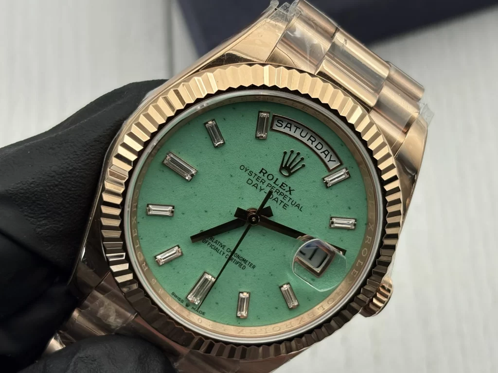
The Day-Date design is built around two calendar displays that immediately create structure on the dial. The curved day aperture at 12 o’clock forms a horizontal axis across the top, while the date window and Cyclops at 3 o’clock introduce a second focal point on the right.
Both areas are unforgiving because typography and alignment are easy to inspect. The day text needs to sit naturally within the aperture without appearing too high, too low, or compressed toward one side. The date numeral has to remain centered beneath the Cyclops, where magnification can exaggerate even a small positioning error.
The light green dial makes these areas even more exposed. There is no dark background to hide a poorly centered white day disc, and there is no busy pattern to distract from the date window. The clean contrast between the green center and the pale calendar discs makes alignment part of the overall aesthetic.
This is also why movement quality on a Day-Date should not be reduced to a caliber name. The visible behavior of the calendar matters just as much. Crown operation, day and date adjustment, the positioning of both discs, and the consistency of the calendar change all contribute to how refined the watch feels in everyday use.
Rose Gold and Light Green Need a Precise Color Balance
The relationship between the dial and the metal is arguably the strongest feature of this configuration. The light green center is relatively cool and soft, while the rose-gold-tone case, fluted bezel, and President bracelet are warmer and more reflective. That contrast keeps the watch from becoming visually monotone.
The balance is delicate. If the green leans too yellow, it begins to merge with the warmth of the case and the watch can feel oversaturated. If it shifts too far toward blue, the separation becomes stronger than intended and the dial may appear disconnected from the surrounding metal. The best effect comes from a pale green that remains clearly distinct while still feeling compatible with the warm case.
The same restraint applies to the rose-gold-tone finishing. The color can easily become too pink or too yellow, and strong mirror polishing can make that problem more obvious. The case, bezel, and bracelet also should not all reflect light in exactly the same way. The fluted bezel can be brighter and more directional, while the broader case surfaces and curved President links should create softer reflections.
That variation is important because it prevents the watch from looking like one continuous piece of polished metal. A more convincing finish comes from controlled differences between surfaces, not simply from maximum shine.
The Fluted Bezel Gives the Dial a Hard Frame
The dial is soft in color and irregular in texture. The fluted bezel is almost the opposite: repetitive, geometric, and highly reflective. Putting those two surfaces next to each other is what gives the front of the watch much of its structure.
The fluting needs enough definition to maintain sharp visual rhythm around the entire circumference. If the ridges become too rounded, the bezel loses the architectural character that makes a Day-Date recognizable. Excessive polishing can also soften the edges visually, especially under direct light.
The height of the bezel matters as well. A bezel that sits too prominently can make the dial appear recessed, while one that looks too flat reduces the formal presence of the watch. This is particularly noticeable on a 40mm Day-Date because the bezel has enough diameter to influence the proportions of the entire front view.
In this configuration, the bezel also performs a useful visual function: it contains the expressive dial. The green texture and baguette markers have plenty of personality, so the rigid fluted ring around them prevents the design from feeling loose or overly decorative.
The President Bracelet Is More Than a Matching Strap
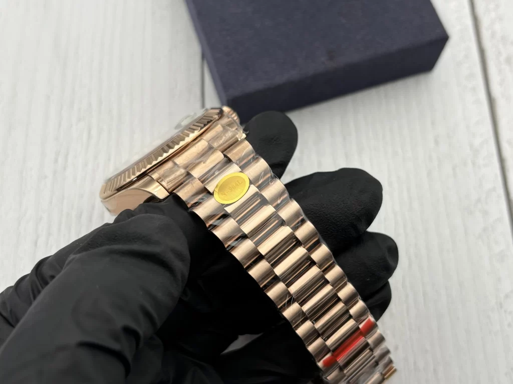
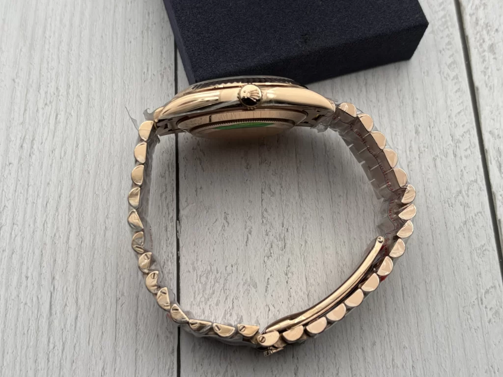
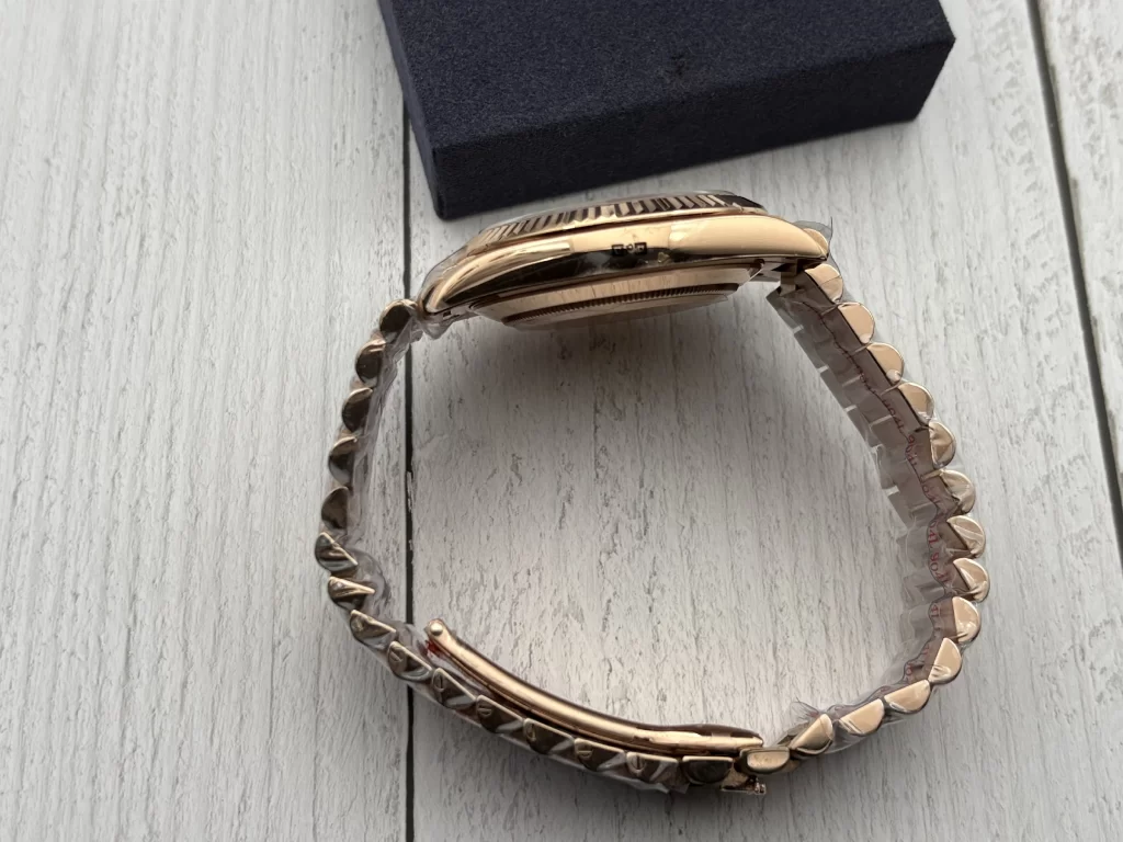
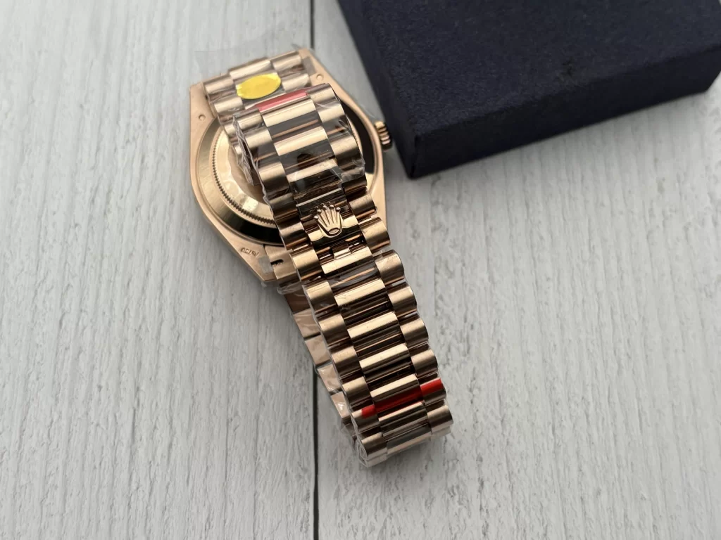
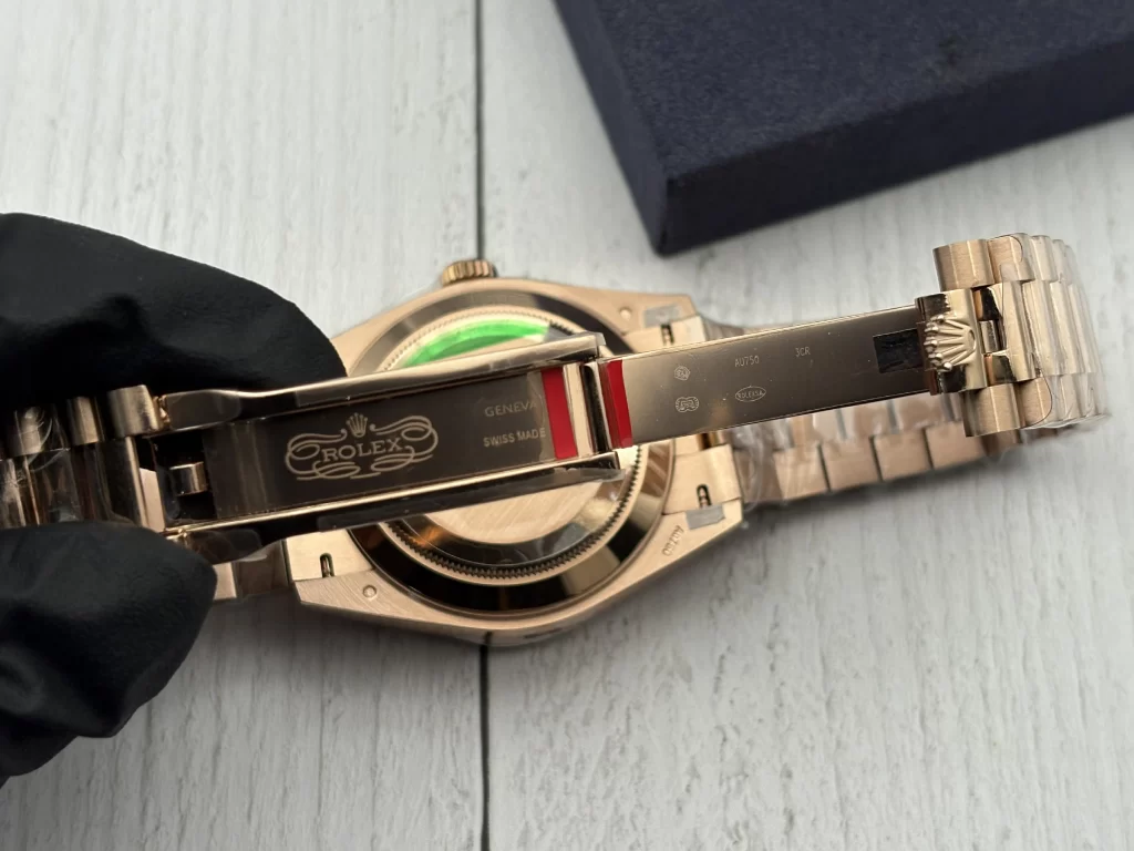
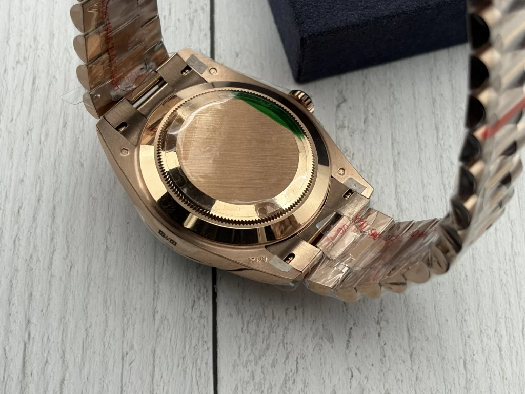
The President bracelet is essential to the Day-Date silhouette. Its rounded links create a softer geometry than the dial markers and bezel, which helps balance the watch visually. An Oyster bracelet would introduce flatter and more tool-oriented surfaces; the President design keeps the watch formal and fluid.
The bracelet needs to support the quality of the dial rather than expose a gap between the watch head and the rest of the piece. End-link fit should be tight, articulation should feel smooth, and the transitions between polished and less reflective surfaces should remain clean. Because every rounded link catches light at a slightly different angle, inconsistent finishing becomes visible across the entire bracelet rather than staying isolated to one area.
The bracelet also has a major effect on how the rose-gold tone is perceived. A uniform, overly polished finish can make the color look artificial, while a more controlled surface treatment allows the warmth to change subtly as the wrist moves. That variation is part of what gives the Day-Date more depth in real wear than in a flat photograph.
What the Actual Watch Shows
The supplied photograph makes the relationship between the dial and the surrounding metal particularly clear. The light green surface is not perfectly even, which gives the center some depth, but the texture remains fine enough that the Rolex crown, printed text, baguette markers, and calendar displays remain easy to distinguish.
The baguette-style markers appear to sit clearly above the dial rather than disappearing into the green background, and their rectangular shapes create an interesting contrast with the soft, almost powder-like dial texture. At the top, the day aperture forms a strong horizontal line beneath the fluted bezel, while the Cyclops at 3 o’clock creates a second area of visual emphasis without dominating the entire dial.
The rose-gold-tone bezel and case produce much stronger reflections than the dial, which is exactly what prevents the green surface from appearing overly bright. The President bracelet then continues the warm metal color but breaks the reflection into smaller curved sections. From the front, the result has several distinct layers rather than one continuous shiny surface.
That layered quality is what makes this configuration convincing when it is done well. The watch is decorative, but it does not depend on one decorative trick.
A Better Way to Judge This Noob Factory Version
The most useful way to evaluate the 228235JG is to look at relationships rather than individual specifications. The green dial should have texture without becoming noisy. The baguette markers should be bright without feeling oversized. The day and date displays should remain precisely aligned. The fluted bezel should be sharp enough to frame the dial without visually swallowing it. The rose-gold-tone finishing should stay warm but controlled, and the President bracelet should feel like a continuation of the case rather than a separate component.
Those relationships matter more than any one marketing term. A watch with a beautiful dial but weak calendar alignment will still feel wrong. A strong bezel cannot rescue an overly artificial metal tone. Perfectly straight markers lose much of their effect if the dial texture looks printed rather than natural.
This is exactly why this Day-Date configuration is an interesting test of Noob Factory’s execution. It combines natural-looking irregularity with strict geometric precision, and it asks the factory to manage both at the same time.
Final Assessment
The Noob Factory Rolex Day-Date 228235JG 40mm light green aventurine dial version succeeds or fails through balance rather than spectacle.
Its strongest visual idea is the contrast between the cool, textured green dial and the warm rose-gold-tone structure around it. The baguette-style markers add strict geometry, the day and date displays maintain the formal identity of the Day-Date, the fluted bezel gives the dial a precise outer frame, and the President bracelet softens the transition from the case to the wrist.
None of these elements should dominate the others. The dial should not become so textured that it looks busy. The markers should not become so bright that they overpower the calendar. The metal should not become so reflective that the subtle green center loses importance.
The more convincing result comes from reproducing the relationships between color, texture, geometry, and calendar presentation rather than simply copying the obvious external features.
That is what makes this version different from a conventional green Day-Date. The challenge is not just to reproduce a color. It is to reproduce a material impression and keep it disciplined inside one of Rolex’s most formal dial layouts.
FAQ
What is distinctive about the light green aventurine-style dial?
The dial combines a pale green tone with visible surface texture and irregular tonal variation, giving it more depth than a conventional flat lacquer dial.
Why are baguette-style markers difficult to reproduce?
Their rectangular geometry makes alignment, height, spacing, and setting thickness easy to compare. Small inconsistencies are therefore more visible than on conventional baton markers.
What is especially important about the day and date displays?
The day text should sit naturally within the 12 o’clock aperture, while the date numeral needs to remain centered beneath the Cyclops. Both areas are visually exposed on this dial.
What should be checked most closely on this version?
The green dial texture, marker alignment, day and date centering, Cyclops alignment, fluted bezel definition, rose-gold-tone finishing, and President bracelet fit are the most important visual areas.
Why does the 40mm format work well with this dial?
The larger dial gives the textured surface, baguette markers, calendar windows, and printed elements enough space to coexist without making the layout feel excessively compressed.